


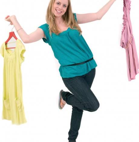
Summer’s finally here, so we’re excited to start experimenting with bright colours! Find out how to choose the best shades for your next knitting project.
Some can be scared of using colour, and understandably so - we’ve all had the odd fashion faux-pas, and combining shades can be a tricky business, particularly in knitting. With all the time and effort involved it’s really important to make sure we choose shades that complement each other, as well as suiting the stitch pattern and the style of the garment. However, once you know the basics, it’s easy to achieve fantastic colour effects that really help bring your project to life!
Match maker
Colour wheels aren’t just a painter’s lifeline, they’re really handy for identifying shades and seeing which ones go well together, which is important when selecting colours for your project. The shades positioned opposite on the wheel are known as ‘complementary,’ as they provide effective contrasts and will enhance each other, appearing more vivid. However, stark contrasts on a garment should be handled with care. Proportion is really important as some colours can be quite overpowering. Most garments or pictures tend to have one main colour, then others that are used as highlights.
Picking and choosing
Elizabeth Jarvis is passionate about selecting and mixing the right colours for knitwear. “Many people tend to play safe when it comes to knitting. If they like green, they’ll stick to it and rarely come out of their comfort zone,” she says. “Try exploring different combinations by looking at books, magazines and pictures for inspiration. When you try something you’ve not thought of before, you can really surprise yourself.”
It’s also important to look more closely about how colours are chosen. “Take Van Gogh’s Sunflowers for example,” she explains. “When you study it closely you see that instead of just being yellows and browns, there are other colours in there too which, together, help make the picture. This concept can be incorporated into your knitting. Different textures can also help enhance colours. You could be working with a smooth DK yarn but by introducing a bouclé or chenille for a few rows, it really adds another dimension and helps bring out the colours even more.”
Feeling daring?
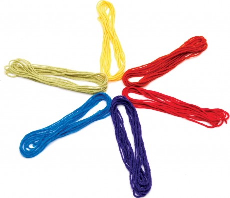
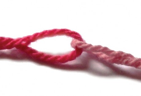
Try taking oddments from all of your favourite coloured skeins, and make up a ‘magic ball’. When knitted, all the yarns work together to create a great multi-coloured effect.
To make a magic ball, either knot the lengths together or use the Russian Join: thread the end of one yarn onto a tapestry needle, then sew it back through its own plies leaving a loop. Thread the next length through this loop and do the same again.
To dye for
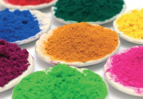
If you can’t find your favourite combination of colours, the other option is to dye it yourself. Debbie Tomkies from DT crafts and Design is an expert when it comes to creating colours. “The most popular dyes and the ones we recommend for beginners are the Kool Aid dyes,” she reveals. [LINK: http://dtcrafts.co.uk/dyesFixers/koolAid/index.html] “They’re good for using with children as they’re food based. Synthetic acid dyes are also common. Most dyes are powder form and are mixed with water to make a solution.”
As in painting, primary shades are combined to produce secondary colours and blends. However, there is no white dye so paler shades are created by diluting the mix with more water. “Proportion is equally important,” explains Debbie. “If you’re using purple with yellow, don’t just use the same amount of each. Try just a hint of yellow for a great effect. I usually suggest people start with two of their favourite colours, or a photo of an outfit, then make a dye to match. Dyeing is great because it’s not like buying a variegated yarn then not liking one of the shades; when you dye your own you can have exactly the colours you want.”
Debbie runs regular workshops using both natural and synthetic dyes, as well as more advanced classes on creating special effects. To find out more or to book a place, call 0161 718 3818 or visit dtcrafts.co.uk
Suits you
Personal colour consultancy can be a huge help when it comes to finding perfect shades for knitwear. There are so many beautiful yarns available that look fabulous on the skein, but you wouldn’t knit a garment in them because the colour is ‘just not you.’
Trudy Cooper, from image consultancy House of Colour, specialises in helping people find the best shades to suit them. “Your most flattering colours have an incredible ability to make you look healthier, more confident, more attractive and clothes will look more expensive and stylish,” she explains. “Sadly, your least flattering shades can make you look unhealthy and tired.”
The process is based around finding the shades that are in closest harmony with your natural skin and eye tones, and these make your skin look clearer and brighter. “The analysis will show you whether your best colours have a cool or warm pigment base and if the density should be clear, fresh and contrasting, or instead, soft and harmonious,” says Trudy. To book an appointment for Colour Analysis or to find out more about the process and image consultancy, call 0800 318526 or go to www.houseofcolour.co.uk
Your personal spectrum – divided into seasons – is the theory on which Colour Analysis is based. Find out which works best for you:
Anyone who is a winter looks best in shades that are cool in tone but clear and crisp. They have clarity and contrast well.
Summer shades are also cool in tone but they are softer and more harmonious. Think of watercolours: they blend rather than contrast.
Spring colours are warm yet light, clear and vibrant. They are never dark.
Autumn features rich yet slightly muted ones. They are deep but not sludgy. There are still some vibrant colours like pansies and marigolds but they are warmer in tone and blend together.
What’s your favourite colour this season? Let us know in the comments!
_333_180_c1.png)


 Baby
Baby
 Toys
Toys
 Garments
 Crochet
 Homewares
 Dolls
Dolls
Share